

“Can you make the logo bigger?”
If you work in web design, you’ve heard this request. Multiple times. Probably on every project. And while it’s understandable—your logo represents your organization and you’re proud of it—making it larger almost never improves your website.
Here’s why.
Your logo is a landmark, not a landmark attraction
Think about your website like a city. Your logo is the street sign that tells visitors where they are. It’s important, but it’s not why they came to visit. They’re here for the restaurants, museums, and parks—your content, programs, and calls to action.
Your logo’s job is simple: identify your site clearly and provide a way back to the home page. That’s it. By placing it in the conventional spot (top left or top center), it does exactly what it needs to do. Users know where to look, they see it, and they move on to find what they actually came for.
When you make your logo massive, it stops being a helpful landmark and becomes a billboard that blocks the view.
Your entire website is your brand
Here’s the thing people often miss: your logo is just one small piece of your brand. Your brand is the complete experience—the colors, typography, photography, tone of voice, and how everything comes together to make people feel something.
A huge logo doesn’t make your brand stronger. It just makes your logo bigger.
What actually reinforces your brand is consistency, clarity, and a website that helps your visitors accomplish what they came to do. When someone has a great experience on your site—finds what they need quickly, feels connected to your mission, donates or signs up—that builds your brand far more than any oversized logo ever could.
Big logos compete with important content
Every website has a visual hierarchy—a system that guides the visitor’s eye to the most important elements first. At the top of that hierarchy should be your headline, your hero image, or your primary call to action. These are the elements that actually convince someone to care about your work, donate, or take action.
When your logo is too large, it hijacks that hierarchy. The visitor’s attention goes to your logo instead of the content that matters. And since they already know what organization they’re on (remember, the logo already did its job), you’ve just wasted prime real estate and attention on something that doesn’t move the needle.
The big guys keep it small
Don’t believe me? Look at the websites of the most successful companies and organizations in the world.
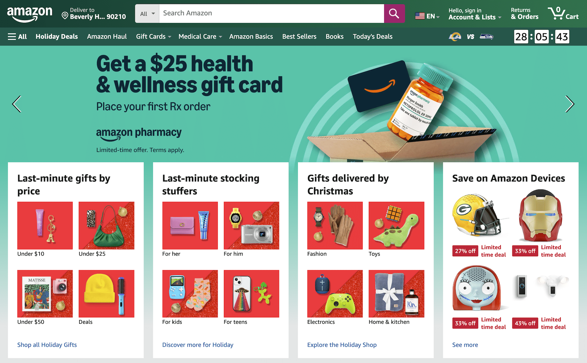
Amazon’s logo is small and tucked into the top left corner. The focus is on search and products.
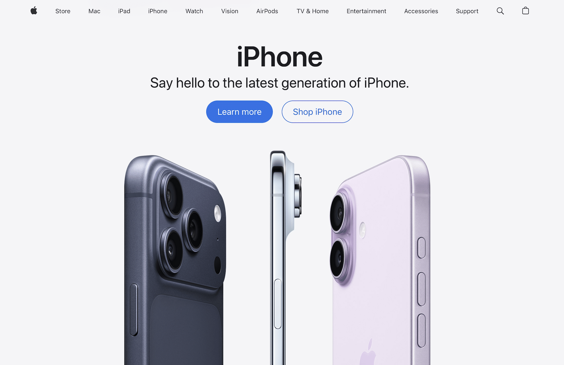
Apple’s logo is tiny—just a simple icon in the top navigation. The focus is on gorgeous product photography and clean headlines.
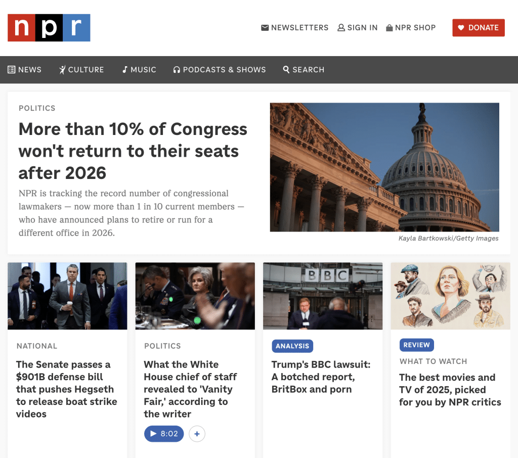
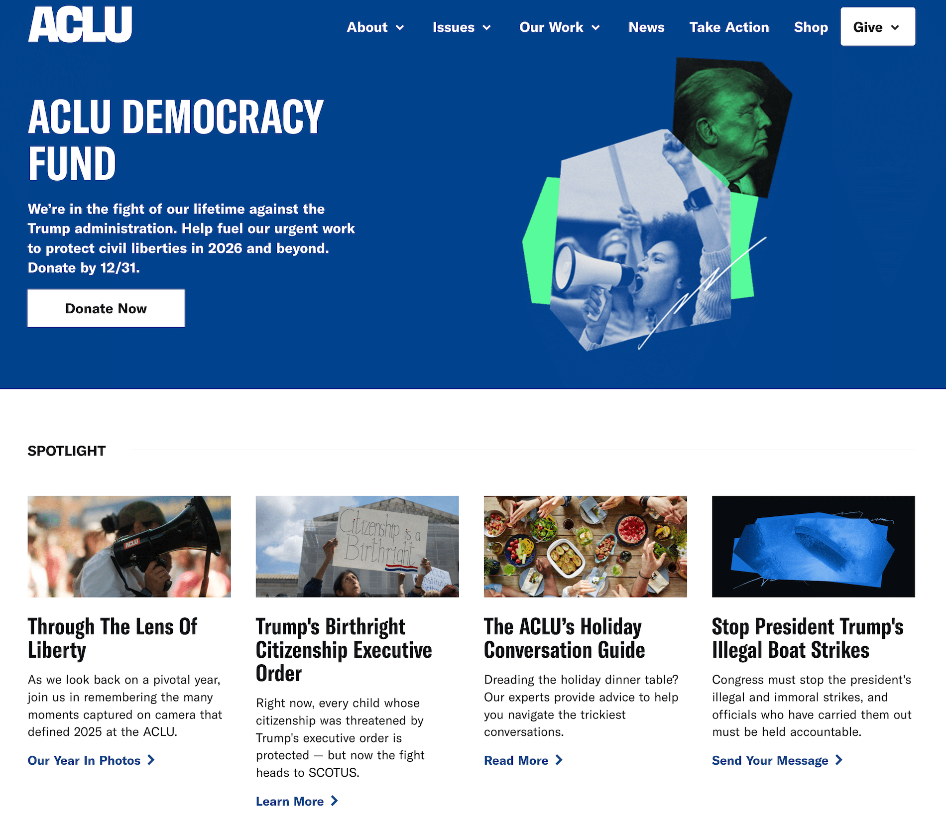
The New York Times, NPR, The Red Cross, ACLU—scroll through the websites of major brands and nonprofits. You’ll see the same pattern: modest logos, prominent content.
These organizations have massive budgets and world-class design teams. If a huge logo was the secret to success, they’d all be doing it. But they’re not, because they understand that the logo’s job is to identify, not dominate.
Your website isn’t a competitive environment
In the real world, there might be good reasons to make your logo as large as possible. When you’re on a conference banner next to a dozen other organizations, or your flyer is pinned to a community bulletin board, you’re competing for attention. A bigger logo helps you stand out in the crowd.
But your website is different. When someone visits your site, they’re already there. They’ve already chosen you—at least for the moment. You’re not competing with other brands for attention. You’re competing with distractions, short attention spans, and the back button.
In that context, the size of your logo is irrelevant. What matters is whether your content is compelling enough to keep them engaged.
What to do instead
If the concern behind “make the logo bigger” is really about brand presence and recognition, here’s what actually works:
- Use your brand colors consistently throughout the site, especially in headers, buttons, and accents.
- Choose typography that reflects your organization’s personality and use it everywhere.
- Invest in strong photography that captures your mission and creates an emotional connection.
- Write compelling copy that clearly communicates your value and impact.
- Make sure your navigation is clear and your most important pages are easy to find.
- Create a cohesive experience where every page feels unmistakably like your organization.
Do all of that, and your brand will be strong—regardless of logo size.
The bottom line
Your logo is important, but it’s not the star of the show. Your programs, your people, your impact—that’s what deserves the spotlight. A small, well-placed logo does its job perfectly. A huge logo just gets in the way.
So the next time you’re tempted to ask your designer to bump up the logo size, take a breath. Trust the conventions that work. And let your content shine.
